
Making Beautiful Documents in LaTeX
Introduction
As a political science student, writing is a daily activity. And like any serious writer who cares about their writing, I care about the presentation and look of my documents. This has evolved, particularly recently, into an interest in typography — the art of formatting and shaping text. The source of this interest was originally my discovery of gnu Emacs’ ability to convert org-mode documents into \(\LaTeX\) ones back in high–school and even today this is still the basis of my process. It was accelerated by my increasing tinkering with this very website, having to design its appearance largely from the ground up.
Writing in org-mode allows one to focus much more on the pure textual content, leaving the formatting for later. Why not write in word and then copy-paste? Because then you still have to write all of the formatting rules (like emphasis) by hand – and Emacs (or another dedicated text editor like vim1) is a much more powerful tool for text editing than any rich-text editor that tries to do formatting and content at the same time.
As my interest in typography has grown I have felt more and more under-served by the default \(\LaTeX\) article class. If you are not already using \(\LaTeX\) (or some equivalent like typst) there is likely nothing you can do that has a bigger impact on your typography than switching to it2.
But there is a great amount of labour that has been done to improve
upon the very high baseline that \(\LaTeX\) provides. This here is my
collection of tips on how to give your documents the treatment that
they deserve. Since I quite rarely touch .tex-files directly I do not
like to rely on elaborate macros, even if they sometimes are very
useful to attain the look that one is aiming for. Instead most changes
are implemented as simple one-liner latex_header’s in org-mode. There
are also no fancy classes involved, everything is done through the
standard article-class.
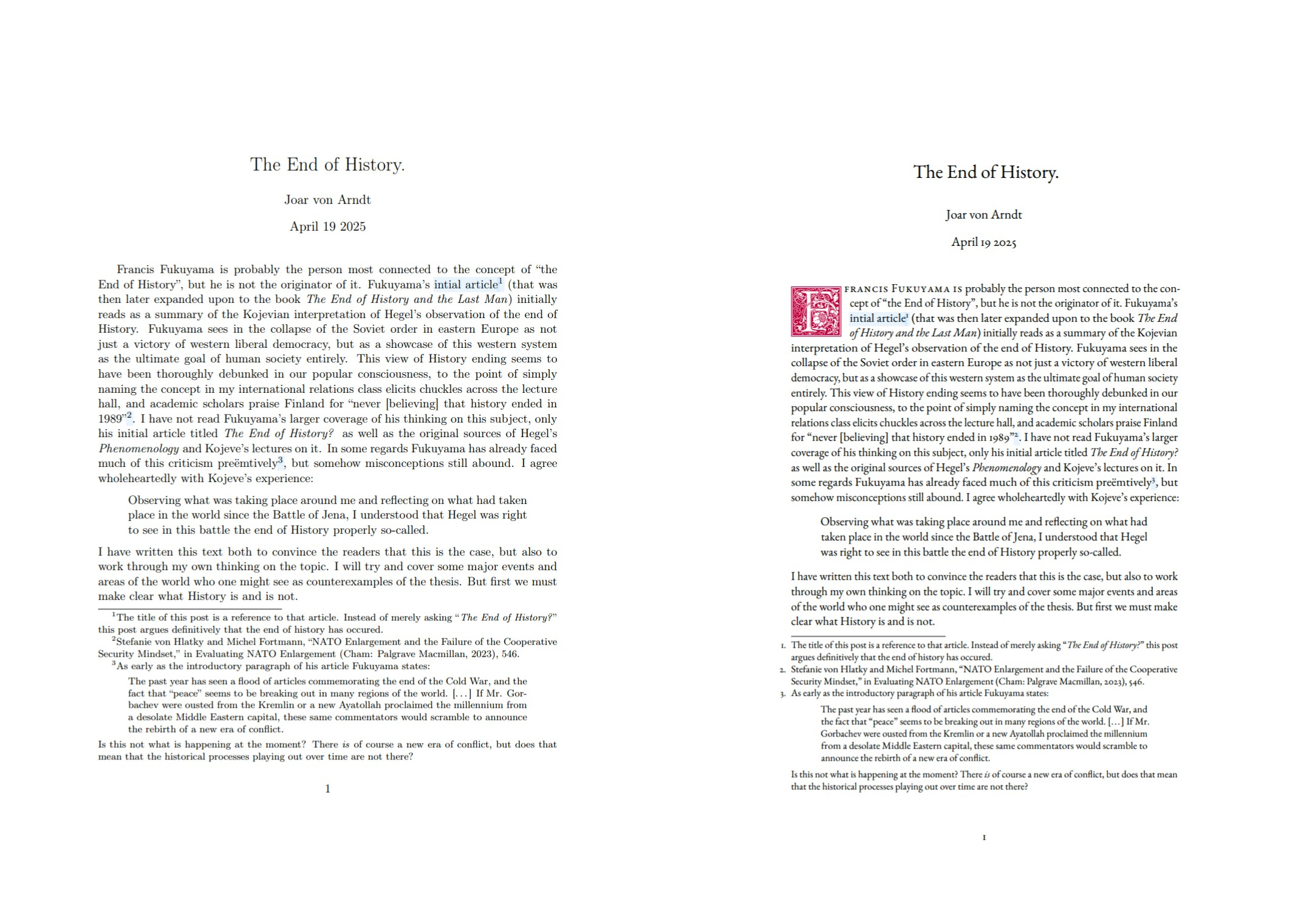
For this post I have prepared a version of my post on the end of history in pdf format that we will successively improve upon. Over the course of this post we will turn the document on the left into the document on the right:
Naturally I should remind the reader of the Latin phrase de gustibus non est disputandum. What I deem beautiful may not seem the same to you. I hope however that the information that you find here can be of use even in the case of disagreement.
Fonts
Fonts are what most people think of when they think of typography, and it (and perhaps line-spacing) is one of the few choices that normal people make when trying to improve their documents. Fonts are not everything, but since they do make up the majority of your content (if not all) they are very important.
First I would like to point out that no, Times New Roman (tnr) is not good enough. In fact, it is actively detrimental to the appearence of your document. tnr shows how you do not care about typography at all, and that you are okay with your text sitting side-by-side with all the other text that has been typeset in tnr. Whenever I see a text in tnr, I consider it a draft; open to critique and lacking any authority whatsoever. Calibri also has this characteristic, but at least it does not try and entertain the thought at being magisterial in any capacity.
Computer Modern (cm), the default font used for \(\TeX\) documents, is a
great improvement over tnr, since it confers \(\TeX\)’s professionalism
and academic regard to your writing. But it too suffers from simply
being the default – you did not go through the trouble of picking
something yourself after all. Nevertheless, if you must use it (and it
is a fine font by itself) do yourself the favour of putting the
\usepackage{lmodern} and \usepackage[T1]{fontenc} options in your
header. This replaces the default version of cm with Latin Modern, a
programatically derived version that includes many more characters
than the default font.
If you want a more interesting font, I highly recommend browsing
through the LaTeX Font Catalogue for something that fits your specific
document. Personally I am a fan of Kp-Fonts and eb Garamond. To use
them simply add \usepackage{kpfonts} or \usepackage{ebgaramond}
respectively to your header. I invite you to try them out in your
document right now. Here is our document typeset in (from left to
right) the default cm, in Kp-fonts, and in eb Garmanond.
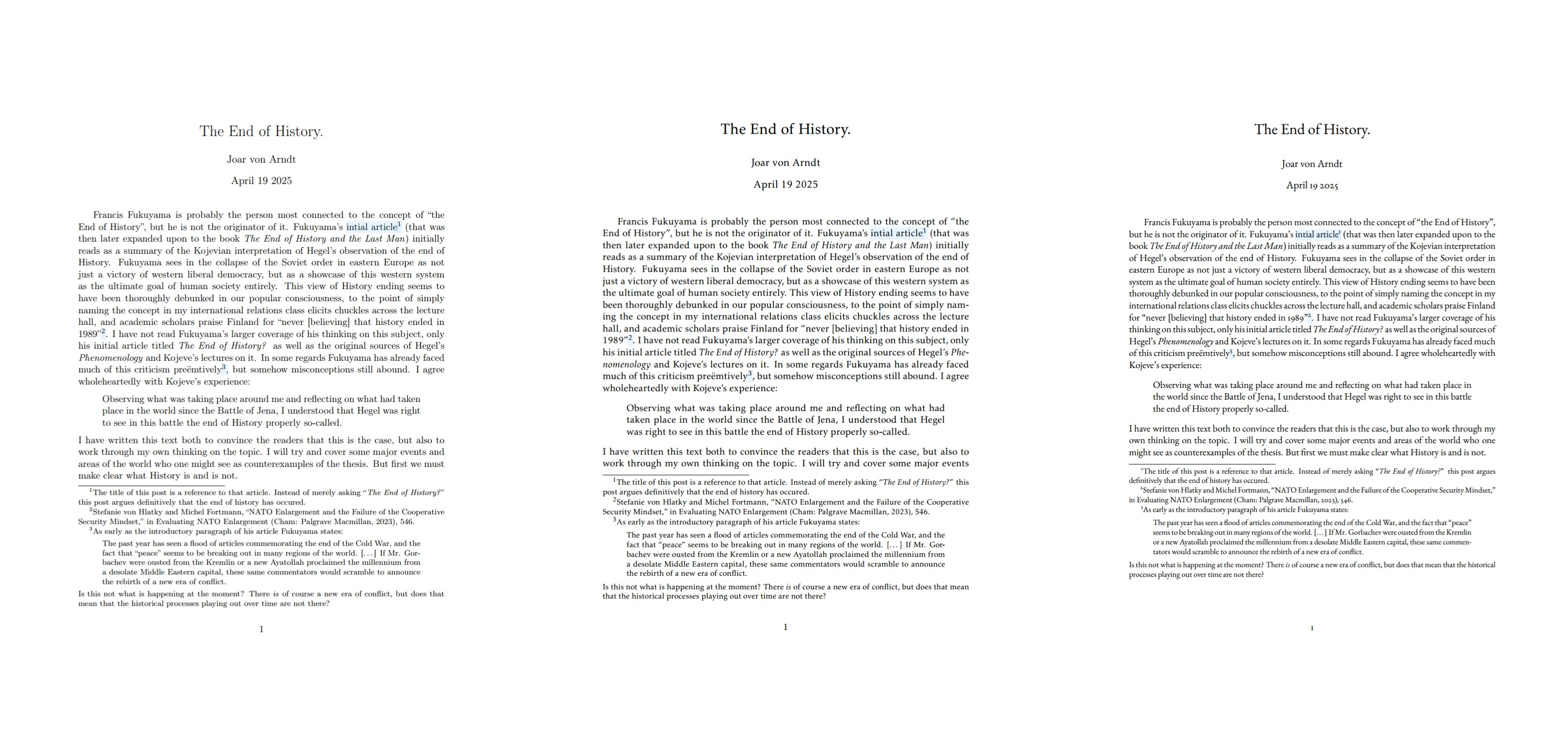
Both of these are good choices, but I am often restricted by page count3 and so I often reach for eb Garamond since it fits noticeably more text on the page. For that reason it is the font that we will continue with for the rest of this post.
Microtypograhy
Another easy improvement is the utilisation of the microtype package
by Robert Schlicht. It provides a single package for lots of different
microtypographical improvements — typography that is not (immediately)
identifiable to the eye but that contributes to the general appearence
of the text.
microtype does not require any configuration at all; it is quite
aggressive4 by default but does not do anything that is likely to
break your document. It provides things like:
| Feature | Explanation |
| Character protrusion | Characters with less “visual presence” like . and — will protrude slightly into the margin |
| Kerning and spacing | Changes the spacing between letters and words. Experimental. |
| Font expansion | Ever so slightly stretches and shrinks letters |
For more information see the package documentation. These things will
likely not be noticed (that is sort of the point) but will help make
the text feel more “proper” and reduce hyphenation. To use it, simply
add \usepackage{microtype} to the header and you are good to go.
That is at least the advice that the documentation gives. But amusingly enough, after telling you to load the package in the official documentation, Schlicht also points out that
if you are not interested in fine-tuning the micro-typographic appearance of your document (however unlikely this would seem, since using this package is proof of your interest in typographic issues), you may actually skip the rest of this document.
Since I am abnormally interested in typographic issues I dutifully continued on. These options that I present here are then experimental and, to once again quote Schlicht, “do not unconditionally improve the quality of the typeset text”. You have been warned.
The first thing I do is to enable kerning, tracking, and spacing
(kerning=true,tracking=true,spacing=true). While these can give some
unappealing effects in some cases I find that they are useful to make
the justification more “dynamic” so as to respond better when treated
badly. This is especially useful when writing documents in languages
with compound words (in my case Swedish and German) since very long
words can mean that \(\TeX\) has very little room to work with —
creating a lot of hyphenation, a lot of whitespace, or both. Allowing
more, smaller adjustments reduces the risk that any single aspect will
look particularly out of place.
I also increase the amount of protrusion that occurs. The default value of 1000 is reasonable, but as the documentation says I am “so proud of being able to use this feature that [I] want everybody to see it”5. Therefore I increase this from default by 50% to a total of 1500.
The final microtypographical change that I make is increasing the
amount of stretch (and shrinkage) that can be done to
letterforms. This can be quite noticeable — especially on characters
such as O or Q — but it is useful in the same way as the different
forms of spacing mention earlier. For this reason it should only be
increased significantly from the default 20 in combination with the
selected=true option that “restricts” stretching for these especially
noticeable characters. With this option I can quite boldly put set a
value of stretch=50.
This ends up with a call to microtype that looks like this:
\usepackage[kerning=true,tracking=true,spacing=true,factor=1500,stretch=50, selected=true]{microtype}
With these settings applied our document now looks like this (this time let us also pick a page with more text):
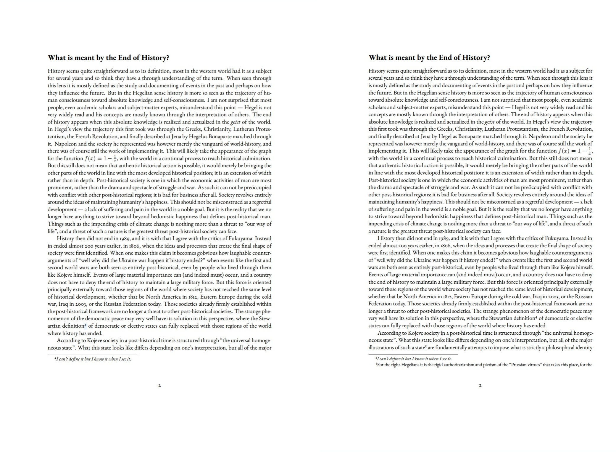
Other than that we fit more text on the page it is difficult to see
any specific changes — the words simply appear to have shifted across
the page. Look at the text along the left margin to see the protrusion
in effect, especially noticeable at the , along the equation.
Improving the footnotes
You may have noticed just from reading this post that I am a big fan of footnotes. On the web sidenotoes are clearly superior since a webpage is infinitely scrollable and the footnotes can therefore appear very far down the page, but a pdf document has many “feet” at the bottom of each page. This means that sidenotes are not as necessary — you can still keep supportive information close at hand — and I generally prefer to format article-style documents with symmetrical margins (with asymmetrical ones reserved for things like books).
The default footnotes are fine, but reading the beautiful microtype
documentation made it clear that there is room for improvement. This
is done in two ways: making the footnote reference markers into
proper, non–superscript characters; and moving them into the margin so
that the text does not appear very jagged when many two- or three-line
footnotes are present on one page.
These are both done through the enigmatic scrextend package. In addition to merely loading it, I run another simple line in the header that reformats the footnote mark:
\usepackage{scrextend}
\deffootnote{0em}{1.6em}{\thefootnotemark.\enskip}
If you want to move the footnote marks into the body text (so that they do not sit inside the margin) you should adjust the numerical values above.
This is what our footnote-heavy first page looks like now6:
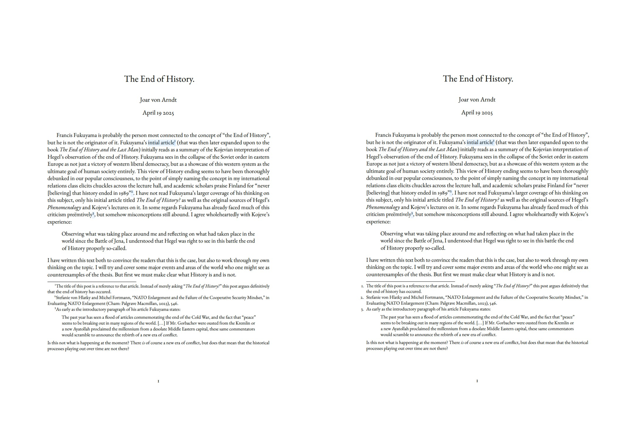
Embellishments
At this point we have a document that is in most regards finished7. I would not have any qualms about presenting something formatted with the above settings as finished. However, one of the strengths of good typography is making your document stand out from the rest — even before the reader has been allowed to grapple with your argument. For this we may add some embellishments of different sorts.
All of this is strictly optional, and may even be harmful to the typographical quality of your text. But I like it nevertheless, and would here like to document some ways that you can do this if you feel like trying it out some time.
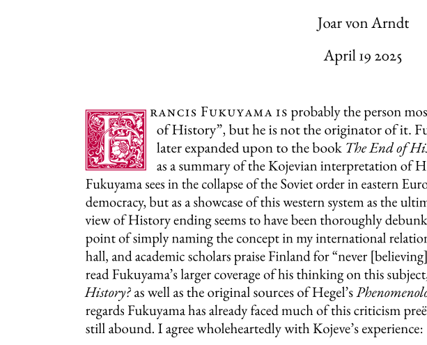
Initials
The first, and my personal favourite, is to add an elaborate initial to the start of your text. Honestly, it is likely the first thing that you noticed when I first presented the final document. One does however have to be careful not to go overboard with this — your document is a presentation of text, not of fancy ornaments — but a little goes a long way in making your text stand out from the crowd.
Dropcaps (or initials more broadly) are provided by the lettrine
package by Daniel Flap’s. Beware — this requires an actual change of the
body text (although I am sure that one could write some emacs lisp to
do this automatically).
First we need to load the package in the header using our beloved
\usepackage{lettrine}, but we then also need to specify where (and
how) to apply the initial. For our text we will write the following at
the start of the first paragraph:
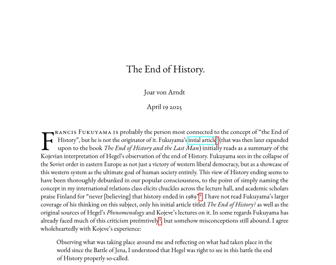
\lettrine[lines=3]{F}{rancis Fukuyama is} probably the …
I find that the default number of lines that the initial will drop down to (2) is almost always too little; If you are using an elaborate dropcap you want your readers to be able to see it. A value of 4 is usually too big however — it should not take up a significant amount of overall space on the page. This might be different if you use a larger amount of line spacing8.
The first argument — the stuff inside the {} — is the letter to turn
into the initial. The second argument is the text that follows and
that should be formatted in small caps (capital letters the size of
lowercase ones). From what I have gathered from reading the Economist
this is usually the first few words of the text.
By default lettrine simply makes your first character very large. This is what our document looks like now:
This is a fine improvement, and works well as an eye-catching detail to a clean and professional document. Stopping here is completely acceptable. But if you dare there is a whole world of fonts for specifically this task.
These fonts are practically small artworks on their own, and so one can quickly become carried away with more and more elaborate designs. For that reason I will offer a few different choices that are all increasingly “busy”.
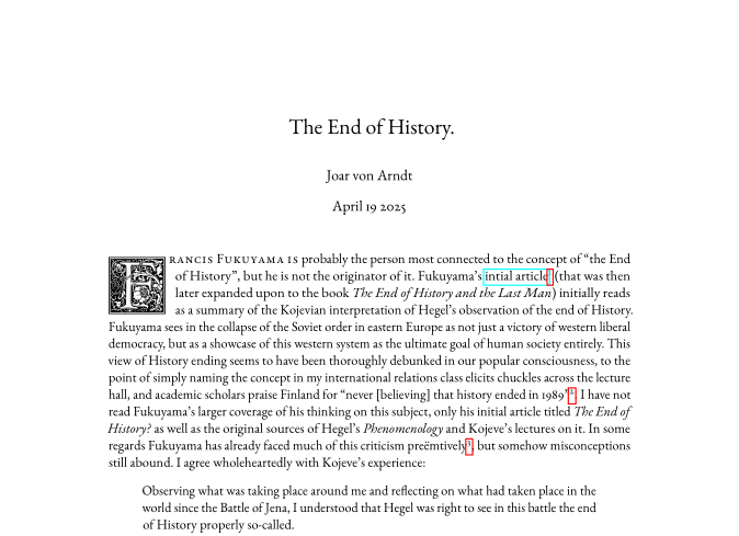
First we have the Zallman Caps font9. It can be used by loading the package, making a small one-liner, and then adding it to the Lettrine font hook:
\usepackage{Zallman}
\newcommand*\zallmaninit{\usefont{U}{Zallman}{xl}{n}}
\renewcommand{\LettrineFontHook}{\zallmaninit{}}
Voilà, we now have a beautiful dropcap with leaves and a flower that still fits in a more strict atmosphere:

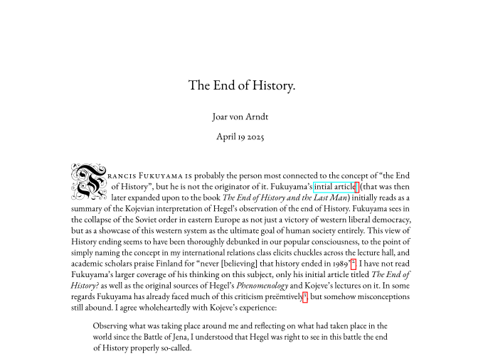
But we can of course go further, this time with Goudy Initialen. This is the font used at the very beginning. It is packed with a lot more detail, so I usually prefer to increase the height to four lines, otherwise it reads as scaled-down. To use it we do just have to write two lines:
\usepackage{GoudyIn}
\renewcommand{\LettrineFontHook}{\GoudyInfamily{}}
And we get this:
You might think that we are finished there — after all, this is the font that I told you that we would end up with. But we can go even further.
Baroque Initials is the initial font of yfonts, a set of old-German
fonts by Yannis Haralambous. Merely the name itself showcases the
baroque hedonism of these fonts. To use them, load the yfonts package
and add \initfamily to the \LettrineFontHook.
#+latex_header: \usepackage{yfonts}
#+latex_header: \renewcommand{\LettrineFontHook}{\initfamily{}}
As you may have noticed, this font does not align itself with the top
of the paragraph, but instead sticks out considerably. For this reason
I recommend not using this font with a large lines-value, since its
visual presence on the page grows very quickly. It is probably
possible to “fix” this (I think this is what is described in the
documentation (p. 132), but I am not experienced enough to decipher
it). A band-aid solution (or alternative style, depending on how one
sees it) is to move the initial slightly into the margin using the
lhang (short for “left hang”) option for lettrine like so.
\lettrine[lines=3, lhang=0.2]{F}{rancis Fukuyama is} probably the …
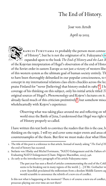
In combination with the hanging footnote numbers I think this looks pretty good, but a good rule of thumb is that “if the reader thinks something looks wrong, and you did not intentionally make it wrong, it is wrong”. For that reason I do not have it as a “standard” dropcap, and it also is quite difficult to read as compared to Goudy Initialen. I still keep it in the “répertoire” however.
Ornaments
If you still feel a need for a more elaborate emblazoned document
there are options. The pgfornament allows you to insert a great number
of different pre-made embellishments into your document. One way to
make use of these is as a typographical mark to signify the end of
your document. I find that this works quite well in combination with a
drop cap, since it means that the embellishments are spread out across
the pages and not clustered in any one spot, and it also works to
“frame” the text as having a connected beginning and end.
Inserting a symbol is very easy; one merely has to write
\pgfornament{X} where X is a number between 1 and 196, with each
number corresponding to a unique symbol. In practice I have found that one often needs to include the scale option to reduce the size of the symbols, like this:
\pgfornament[scale=0.3]{70}
Let us put this at the end of the document. Since I am writing the documents in org-mode I will wrap this in a block to center it:
#+begin_center
\pgfornament[scale=0.3]{70}
#+end_center
This is the resulting \(\TeX\) code:
\begin{center}
\pgfornament[scale=0.3]{70}
\end{center}
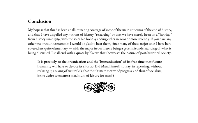
It is a bit too close by default, let us add some vertical spacing.
\vspace{1em}
\pgfornament[scale=0.3]{70}
Perfect.
Colours
The human mind finds few things more eye catching than the strong and striking use of colour. Once again, a little goes a long way. Because we are so drawn to colour we must use it sparingly, lest the contents of the long, grey text become unappealing. Thankfully we already have a set of discrete elements whose contribution is merely of a visual and stylised nature — that being our embellishments from before.
We can turn these into a proper colourised versions with the xcolor
package. This comes with a set of predetermined colours, like for example \color{purple}:
I find that this in practice reads as a darker, red or burgundy rather
than purple, in some ways resembling the colour of a stamp or of wax,
and so fits especially well with the clean-edged Goudy Initialen. To
apply colours you just have to write \color{"colour-name"} right
before the element that you wish to colour. For our beloved drop caps
that means changing the header command:
\renewcommand{\LettrineFontHook}{\color{purple}\GoudyInfamily{}}
It is also interesting to make your own custom colours, particularly so that there is some connection to the subject matter at hand or to some organisation. This is done by defining a new colour like this:10
\definecolor{fhs}{cmyk}{1, 0.22, 0, 0.65}

Paper format
By default \(\LaTeX\) uses the North American letter format, while the
rest of the world uses the iso 216’s a4 as the most common paper for
documents to be printed to. This is easy to adjust however, and one
merely need to add an \usepackage[a4paper]{geometry} declaration to
their header. Apparently overleaf uses a4 by default, but specifying
is never a bad idea.
The geometry package also allows you to to tinker with the margins of
your paper, and I always like to do so as a finishing touch right
before officially finishing a document. Having your article end at the
bottom of a page makes it look a lot more planned out and thought
through than one that has half a page of whitespace and the end. If
you do not want to change the margins all too much I also recommend
tinkering with the microtypographical settings — they can have a
surprisingly large impact on the physical length of the text.
Another benefit of including ornaments at the end of the text is that they mask any slight imperfections in paragraph length. They naturally fill up any whitespace that may be left, and you can resize them and change their appearence to make them fit into the organically appearing gap.
Conclusion
A core value in my document-preparation philosophy is that it should be easy to do good work. If making something look nice means painstakingly manipulating letterspacing or writing an ungodly number of curly brackets then your typographical system has failed. One of the wonders of \(\LaTeX\) is that is separates the art of typography from that of writing and editing.
The goal should be to have strong, opinionated, and elegant typography that gets out of your way when you need it to. It is not the job of the designer to curate your thoughts, and it is not the job of the writer to make your document look good11. These are two separate tasks that should be undertaken separately.
There are many people that think the above and take away the lesson that because they are not “designers” they should not think about the appearance of their text at all. But that is the wrong lesson. If you care about your text you have to care about its presentation. At this year’s Chaos Communication Congress Frieder Nake said that
Somebody who wants to be an artist must be arrogant. […] The artist is in a way so stupid that they do not allow self critique.
This is what is required of you as an artist; as an artist in the sense of a creator of new, radical ideas. If you do not believe that your work is, as Nake puts it, “the best in the world” you will not have the confidence to venture out into the world and present it. To do this one must be a designer and an artist. ❦
Footnotes:
eww.
It is of course possible to create beautiful documents without using \(\TeX\), but most people (including you) are not skilled enough to do so.
Yes, page count and not word count. Even more bizarrely I am sometimes restricted by both (as in 800-1000 words spread across a maximum of two pages). Bizarre.
To the extent that microtypography can be aggressive.
I do not quite think that “everyone” will be able to see it, you will still have to look quite hard to see the difference if you do not know what you are looking for.
The left picture is now also the microtype’d front page.
I would perhaps add a \noindent at the start of the first
paragraph, although you will soon see why I have not done so.
I dislike the trend that large linespacing supposedly improves readability in any way. I personally find the huge amounts of whitespace distracting — it makes the text appear “streaky” as opposed to a more homogeneous grey.
I discovered this font from Chavdar Dutsov’s post on drop caps.
Either an external or your inner designer/writer one.
