Designing Business Cards
Using business cards
I usually always carry a few business cards. This is quite uncommon in this day and age, with the need for remembering phone numbers having disappeared and with the ubiquity of social media for creating, sharing, and maintaining contact. But I reject the use of mainstream social media, partly for ideological reasons but also for practical ones1. This inevitably requires making certain sacrifices when it comes to what events I can participate in, on how learning about what people I know are up to, and on how I can communicate with the people in my life around me. There are some drawbacks that you might expect — you can not dm someone on instagram if you do not have instagram yourself — but there are hidden drawbacks that may not be immediately obvious.
People want to communicate in the medium that they like the best, that is almost tautological. While I am not shy about my feelings about the wonders of email I still do not expect others to share them. This means I that email is usually not an option. But I still want to use open standards. Thankfully, likely because of their open nature, these standards are next to ubiquitous. Email is one of them, and sms (and phone calls) are another. sms is not a great technology by itself (primarily because it is not encrypted), but it works well enough for planning meetups where you can continue talking about your secrets in person. Signal works very well in combination with this, as you can give out your phone number to people and easily “upgrade” to an encrypted connection if your conversational partner has signal. But people usually do not prefer using sms, and so there will always be some friction in dialogue. This is the use case that business cards serve for me.
When meeting a new person, they will commonly ask for my {snapchat, instagram, twitter et cetera} and I will proceed to have a short conversation where they cycle through the services they use — followed by me saying I do not use them. Business cards instead allow me to quickly communicate my preferences without going through a fruitless conversation, and are usually well appreciated. Since business cards are so rare in regular interpersonal contexts they serve as a good conversation starter and are quite memorable as well. The cards contribute to a memorable interaction, and mean that people are more likely to keep in touch (since they get to keep the card).
My first batch of cards were made in 2023, and I made a total of 250 of them. I usually carry a few (2-5) on my person at all times and give them out to new people I meet. If I am going to some kind of networking event I might bring more, but usually not more than will comfortably fit in my phone or wallet. Having carried them for perhaps 2 and a half years now (and also having run out) I get an average consumption of:
(/ 250 (* 365 2.5))
;;; => 0.273972602739726
So I have on average given out one card every 3-4 days. This does not mean that I meet someone new that often; what commonly happens is that I meet lots of new people in a new context, and proportionally give out lots of cards at once. A common occurance is that I give one person a card, and then that person shows shows other people (“omg look at what Joar gave me”) and then more people ask for them. That means having to carry cards unnecessarily most days and running out almost immediately when I do need them. Nevertheless I have found a target of 5 cards is a good amount.
Designing the face of the card
If you are thinking of getting cards of your own I highly recommend designing them yourself. It is a great opportunity for a truly free form of creative expression. No one is in charge of deciding how your cards will look or be shaped other than yourself, and its a way to express yourself in a new medium. While most printers will give you a generous bulk discount for ordering large volumes of cards I like that smaller orders allow you to experiment with new designs and doesn’t put as much pressure on getting it “right” the first time.
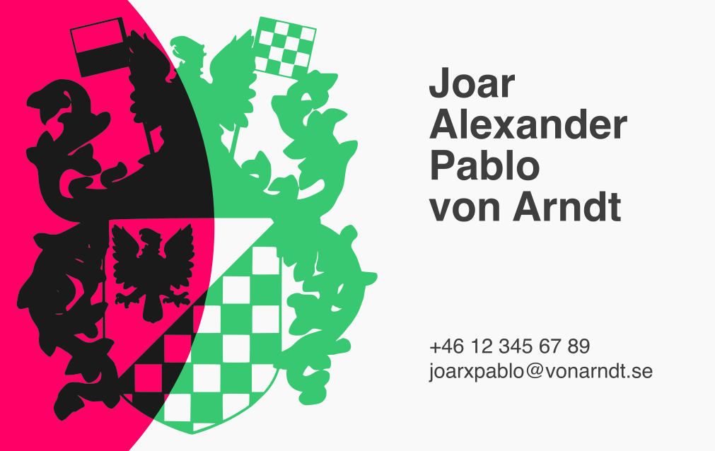
With the new second-generation cards I had a few things that I wanted to do with the design:
- Move from a Swedish business card format to a more continental size2. This is the size of credit cards and ids and so will comfortably fit into people’s wallets. This was a very annoying issue, and I am okay with sacrificing the ability to use certain business card holders.
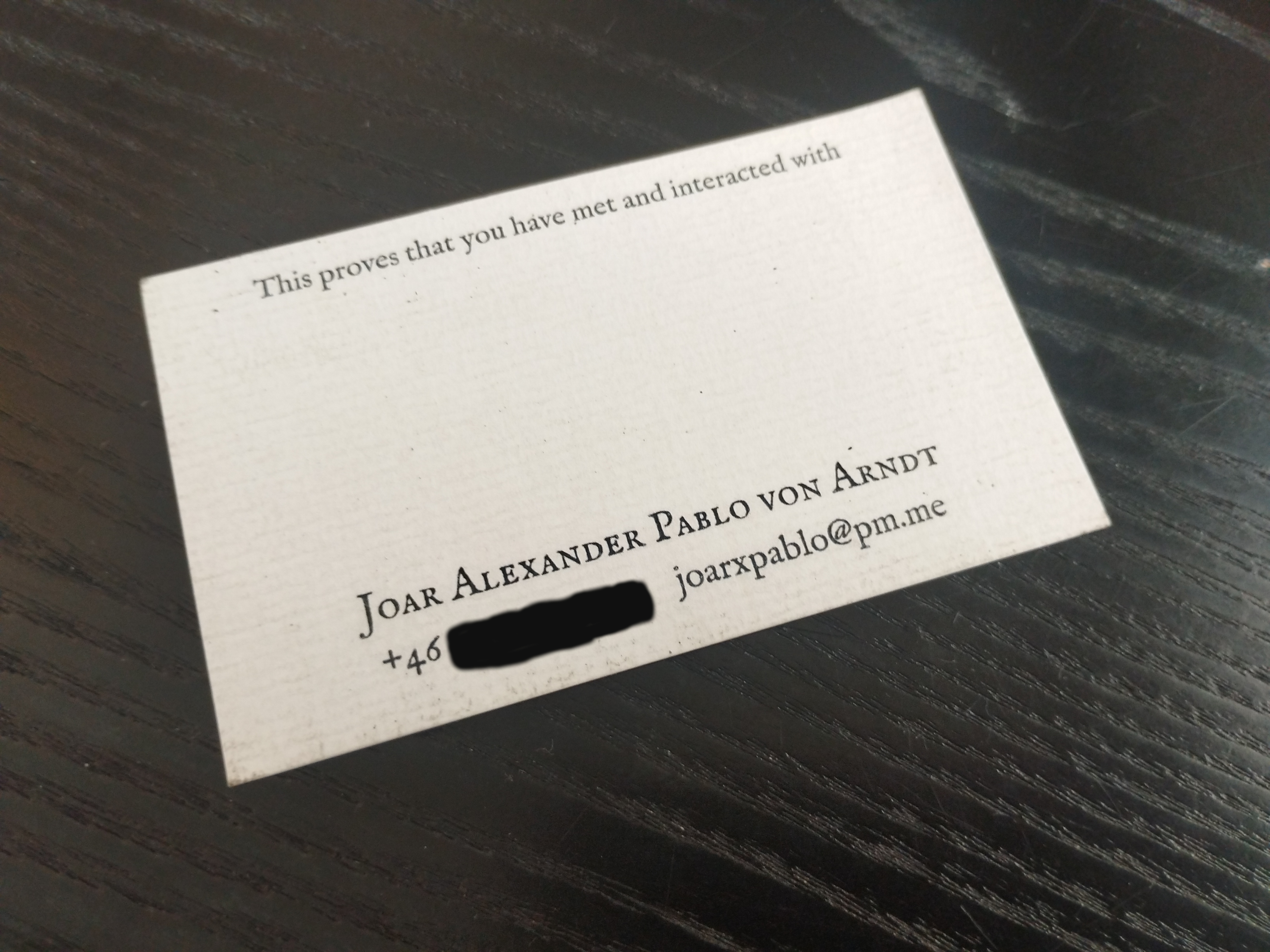
- Include my whole name. I think “Joar Alexander Pablo von Arndt” looks quite striking when written out in full, and so I would like to include it once again on the card, rather than just the shortened “Joar von Arndt”. It is quite long however, and so requires some creative design work.
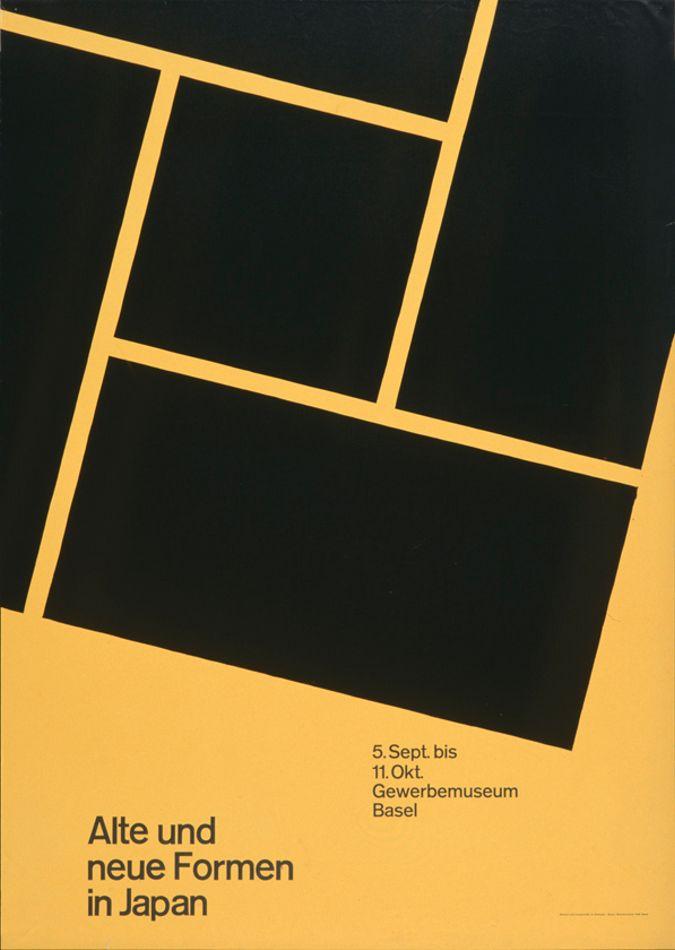
- Make use of the International Typographic Style or elements from 1960’s Swiss-style design. This is a deviation from my old design using the older-looking serif font of im Fell. This might have been caused by watching the wonderful documentary Helvetica (2007).
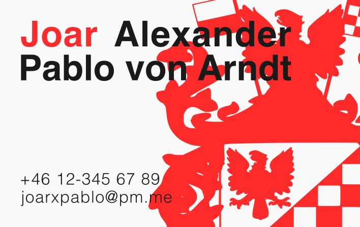
- Switch to the new provider-independent email address of “joarxpablo@vonarndt.se”.
- Use the correct domain for this website, rather than redirecting from my old neocities domain.
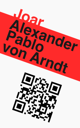
This is the first-generation card that is being replaced:
The line at the top is fun, and has on some occasions sparked conversations just by itself, but I did not feel a very intense need to keep it for the next batch of cards as it is quite difficult to work into another design and also may be a bit too narcissistic. The texture on the card is from the paper, 300gsm Conqueror laid.
Throughout the creative process, I saved eight different designs as ideas worth keeping around (so that I could continue working on them or use them as reference). There were of course an infinite number of variations of these, some of which were different enough so that they could very well be regarded as new designs of their own. These are the ones that survived, displayed in as chronological an order as possible.
First draft
I first experimented with a portrait design:
The idea was to have the “ribbon” extend all around the card to give otherwise two-dimensional card a three-dimensional quality when held in the hand. I didn’t find a way to implement the qr code well into this however, as the ragged edges made it feel unnatural when facing up against the edges of the card. I am aware that it is also not parallel to the ribbon (this was merely a quick draft). I also wanted to play around with the name as an “actor” in the design, merging into its surroundings.
I still wanted to work with striking, bold colours that had not featured on the monochromatic card that I had earlier, and I also wanted to use the family crest in some way:
Second draft
Here I kept the focus on my first name, so as to make it easier to remember when meeting me, and had the crest “peer in” from outside the frame. This is inspired by a poster made by Armin Hofmann3. I found it a little too busy however, and perhaps might make me look very nationalistic with all the eagles in focus.
Third draft
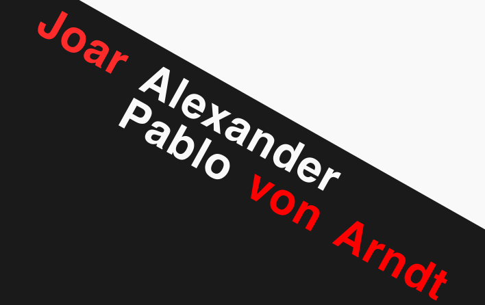
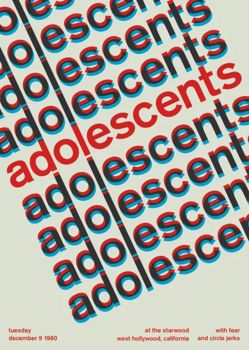
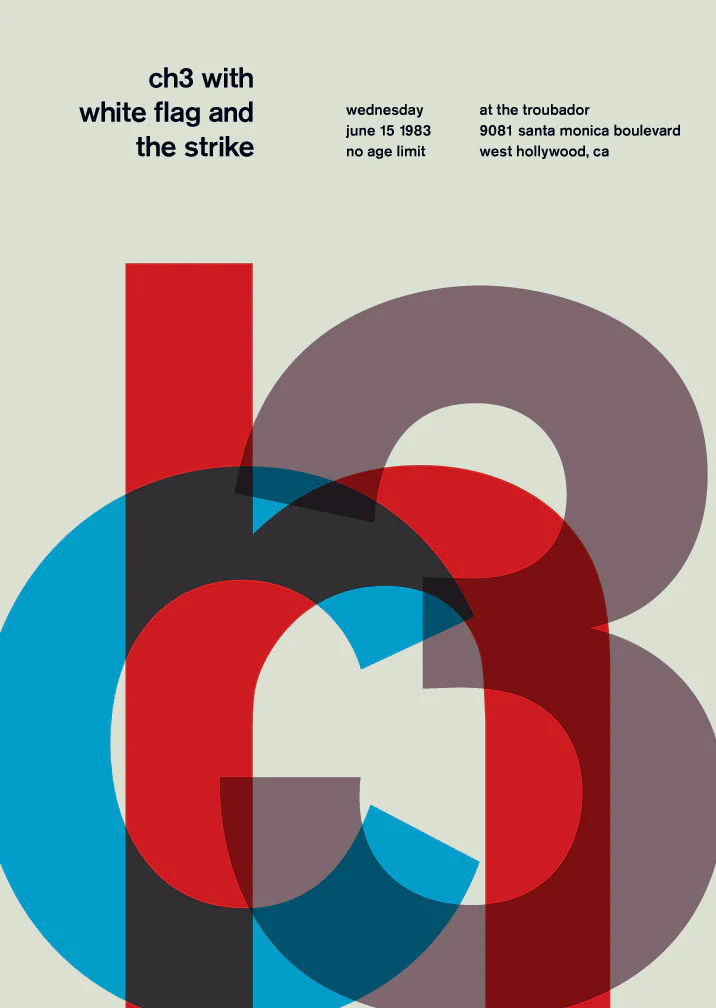
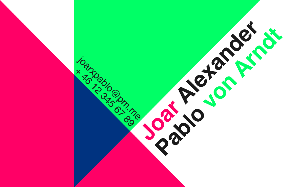
Here we are back to the “diagonal stripe” that I experimented with in the first draft, although I have given up on the vertical format. The diagonal text is quite common in Swiss-style design, but these were perhaps most directly inspired by Mike Joyce’s redesigned poster for an Adolescents concert4. Here I am also experimenting with splitting up the name into different parts and also trying to visually distinguish the middle names from the first and last name.
Fourth draft
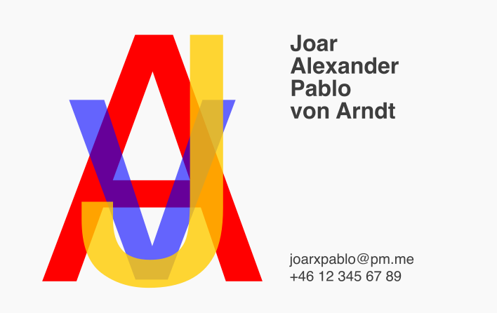
Here I trying to use only visual elements, with the actual name taking up less of the visual attention. This was inspired by designs that emphasise some arbitrary shape5 or textual element like initials6. My initials, JvA, carry some extra meaning in Swedish, as they are the same as those of Joakim von Anka (the Swedish translation of Scrooge McDuck) with the initials prominently displayed on the side of Scrooge’s vault:
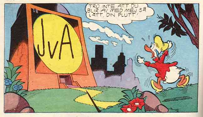
This might itself be an idea for a future design, shaping it in the style of a retro Donald Duck cartoon.
The “v” and “A” work quite well together owing to their symmetrical and triangular nature, but the “J” is quite jarring. This is made worse by the fact that it descends slightly when typeset in Helvetica Bold. I was however a fan of using multiple overlapping elements that combine in visually interesting ways.
Fifth draft
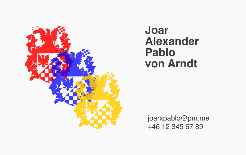
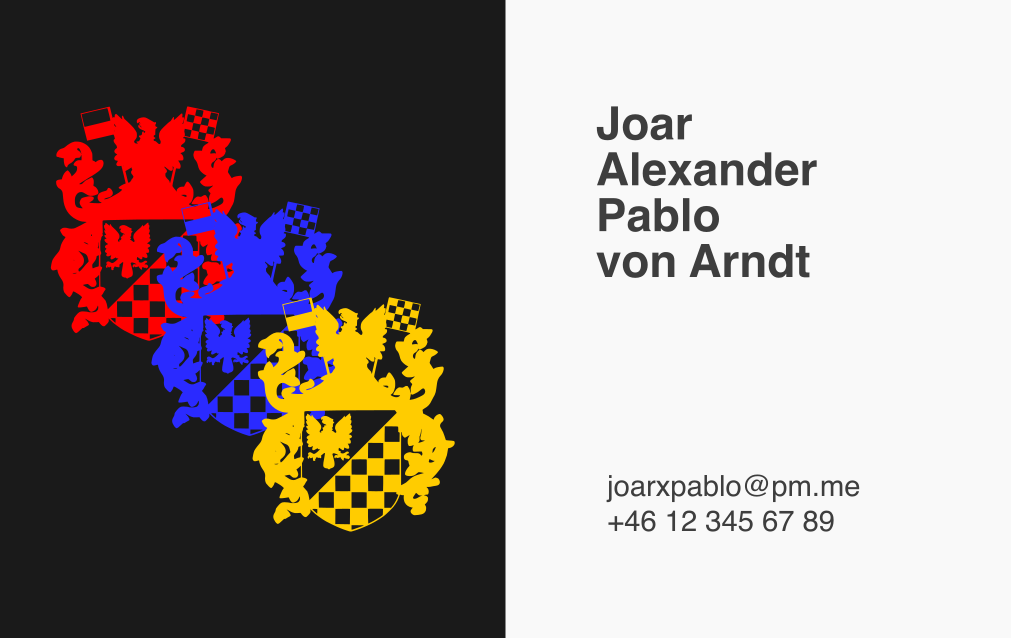
This is when I realized that I do actually have an arbitrary design to work with; the crest. This design felt quite playful and took some of the edge off of using a nationalistic crest. But I was still not happy with the amount of whitespace present in these designs (as can be inferred from my attempt to break it up with a different background colour), and I had trouble arranging the crests in a way that I found satisfying.
Sixth draft
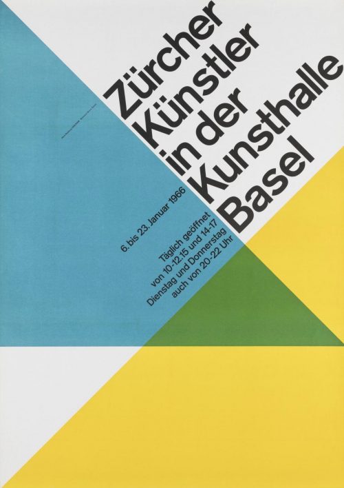
t.s. Elliot famously quipped that “Immature poets imitate; mature poets steal”, and so what no matter the skill level I should try and copy that which I want to emulate. In this case it was a poster by Hans Neuburg7 that I particularly liked. Here I also used colours to mark the different parts of my name like I did in the third draft. I did however also come into trouble with fitting a qr code somewhere that looked natural. It also looked a little bit too “pre-designed” for my taste, as if I had merely filled in a template online.
Seventh draft
At this point my creative process was perhaps moving in a dialectal fashion, with me bouncing between more maximalist and minimalist design (while still staying within the generally minimalist Swiss style) and converging on a “correct” style. While the here crest has been toned down a bit, it still felt a bit too busy, especially when you put multiple of them on top of each other. For that reason I wanted to combine it with the most harmonic of shapes, the simple circle.
You can also see the influences from the second draft, with the primary visual element “peering in” from outside. The right-side-text has also remain almost untouched since the fourth draft, still typeset in Helvetica Bold/Regular.
The issue I had here was that the entire card felt very left-heavy, with dark, intense colours that were not counterbalanced on the other side. This once again moved me in a more minimalist direction for the final design.
Eighth draft
This is by far the most minimalist design yet — not featuring a large visual element and working almost exclusively with text. The biggest break that this makes is that it is the first design that doesn’t use Helvetica, the typeface that is almost synonymous with Swiss design. Instead it uses Futura — a famous Bauhaus-style typeface. That almost the entire card is empty also serves a practical purpose; it allows me to write small notes or greetings on cards when giving them away. This was something I did semi-frequently on the original design, and so it is a good bonus to have on the continued design.
The “interlocking” of different levels of the name gives it some visual interest, and contributes to the feeling that it is custom-made rather than just a template, like in the sixth draft. That each name begins (and ends) on a different vertical line also makes the text appear more like a proper design rather than just left-aligned text.
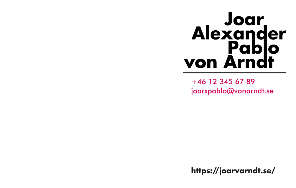
Designing the back of the card
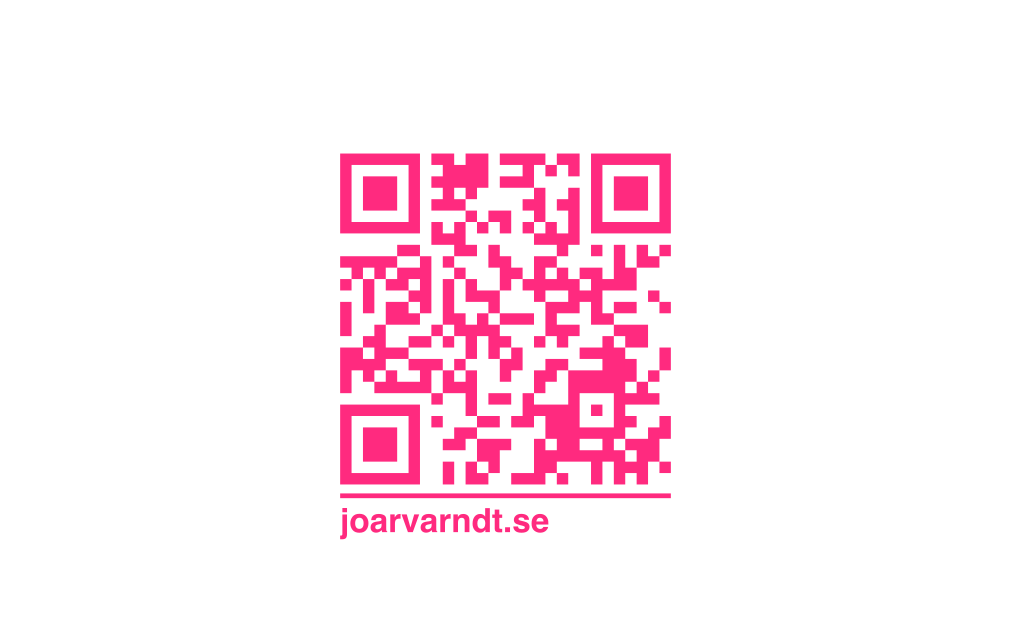
Compared to the front, this was quite easy. This side should not try to “compete” with the front for attention, but should more just be a supportive space for additional information, chiefly a qr code to this website. For this I had three main approaches.
Design one: Just keep it
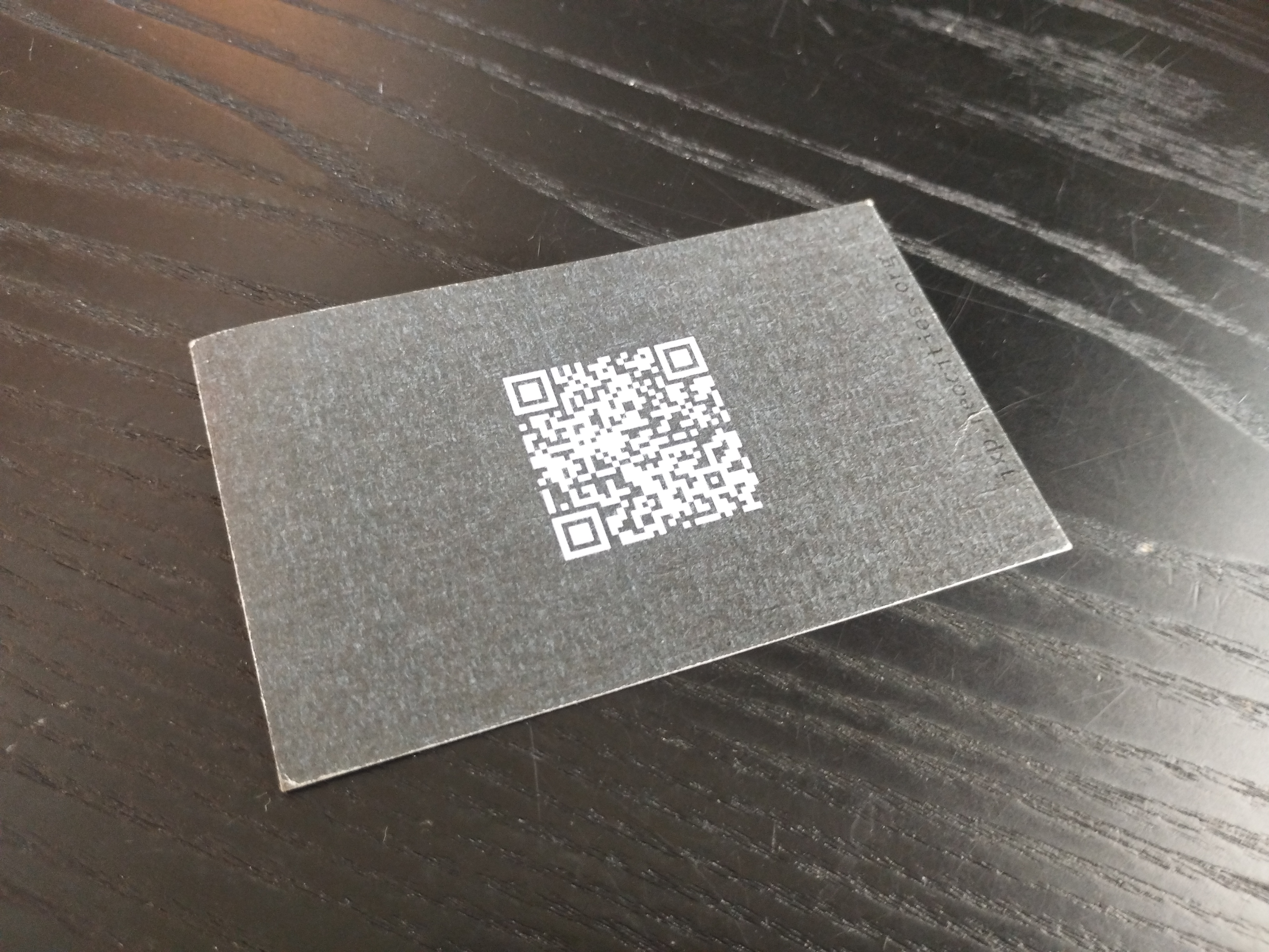
The first idea was to simply keep the same back design as on the first-generation card; but perhaps invert the colours (black qr code, white background). This was simple, looked clean, and worked well. But I did feel like I wanted to make it different, if for no other reasons than that I now had the ability to.
Design two: Adding some simple text
The second idea was developed at the same time as the seventh draft, as can be easily deduced from the colour scheme. This had the added benefit of not requiring a phone to scan the qr code if you’re sitting at a computer, and also looked quite good.
Design three: Work in the crest
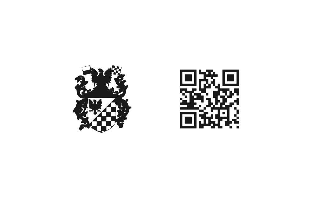
The final eight draft ended up being very empty, even if clean. This made me reluctant to simply leave the back completely devoid of visual interest, so I wanted to add the crest there instead. This had the added benefit tying into the design of the website, someone “travelling” from the surface of the card to the website would immediately feel a sense of connection between the two — the crest acts as a form of identification that these two things have the same author.
Conclusion
Designing your own business cards is not just a fun project, but it is also practical. It makes you more willing to give them out, that is why you made them the way they are after all. I highly recommend anyone to do the same, and please email me if you do — I’d love to see what you have made. I made all of my designs in inkscape a wonderful free-as-in-freedom vector design tool. I printed my cards at Pixel Palace, an independent print shop in Stockholm. ❦
Footnotes:
There are a multitude of reasons for why I do this, and they are too multifaceted to quickly cover here.
This 85×55mm size is technically not the same as the “iso/iec 7810 id-1” size of 85.60×53.98mm that is used for credit cards, but it should work well enough. The Swedish format is 90×55mm, and so is too wide to fit into credit card holders.